
Roger Excoffon’s ultimate typeface
For the past few years, I have been working on the final typographical creation upon which Roger Excoffon had set himself. Originally, the typeface was to be published by Berthold in the 70s, but it never came to pass. What was initially a simple digital restoration exercise, has transformed over time into a real work of research; amazing, complex, and terribly exciting. It was last summer that I began lifting the veil on this undertaking, which has now finally entered its implementation phase.
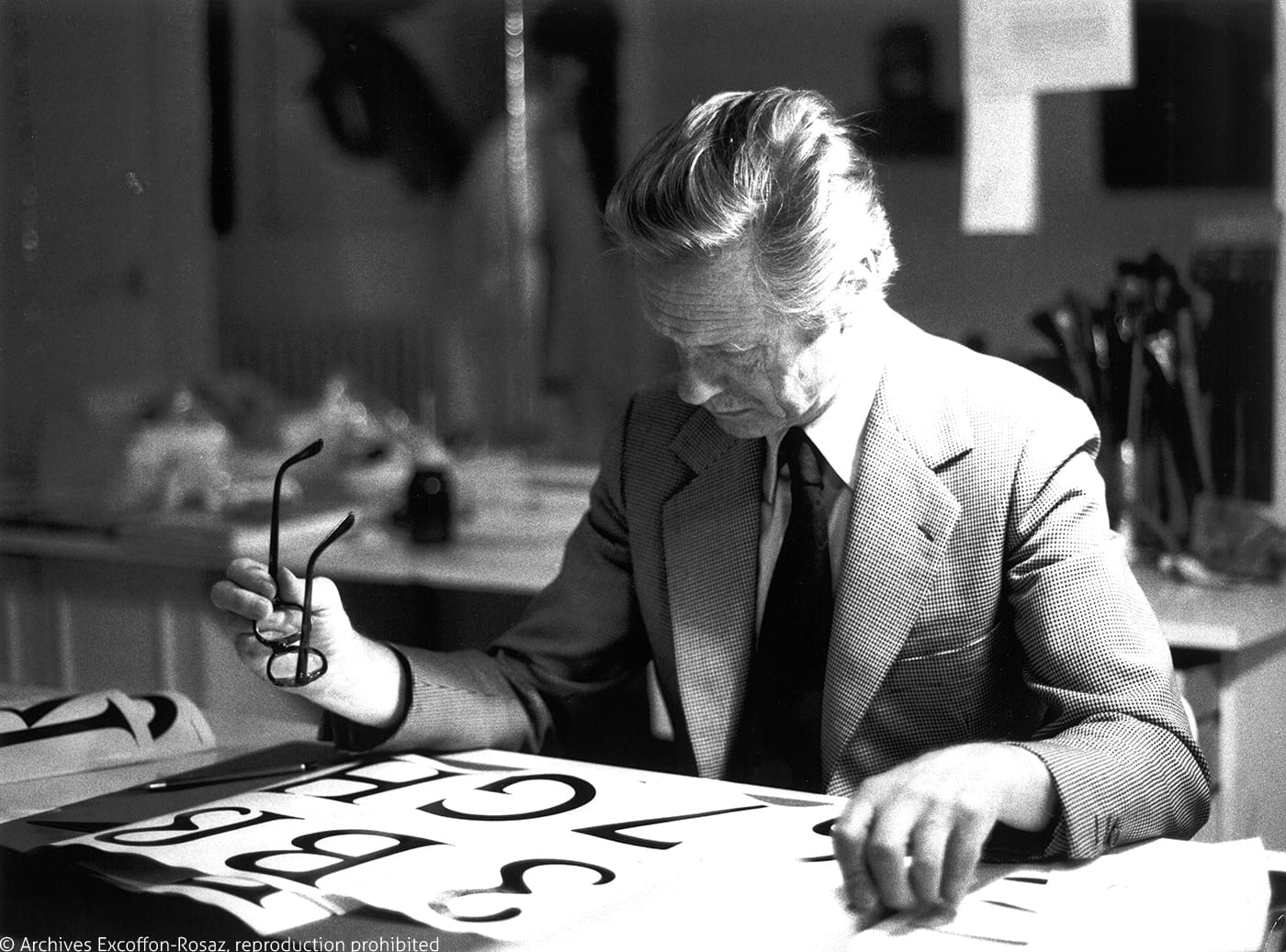
In the early 1970s, Roger Excoffon was at the height of his glory. He created a series of typefaces that ended up making a profound mark on their era. Vendôme, Banco, Choc, Mistral, and Antique Olive, to name but a few, had been huge successes in the 50s and 60s, to the point that they symbolized a certain French style. In his twenty years of designing and creating at the Olive Foundry (Fonderie Olive), Excoffon demonstrated his extraordinary mastery of drawing, his ability to seek new forms as well as to push the technical limits of his time. He was internationally recognized. His collaboration with the Olive Foundry ended after two years, and his advertising work, which had launched 20 years earlier in parallel with his position as Artistic Director at Fonderie Olive, were also great successes.
This era was also one of those that saw many moments of technological transitions, moments that have been well-known to the typography world since the early twentieth century. Lead was giving way to light, and the advent of phototypesetting was on its way. Machines were beginning to be deployed on an industrial scale, and the foundries were busy transposing their lead catalogue into phototypesetting versions. However, it had been very rare that typefaces were created specifically for phototypesetting. The foundry Berthold AG had specialized in phototypesetting from as early as 1958. In 1973, Berthold decided to commission Roger Excoffon for a typeface dedicated to this revolutionary technology.
Roger Excoffon and Günter Gerhard Lange, artistic director of Berthold, agreed to the creation of the Excoffon Book, an old-style text face that was going to be “different”. This would be followed by three years of work and travel back and forth between the two parties, but alas, would unfortunately end in a sudden and confusing breach of contract in April 1976.
Four decades later
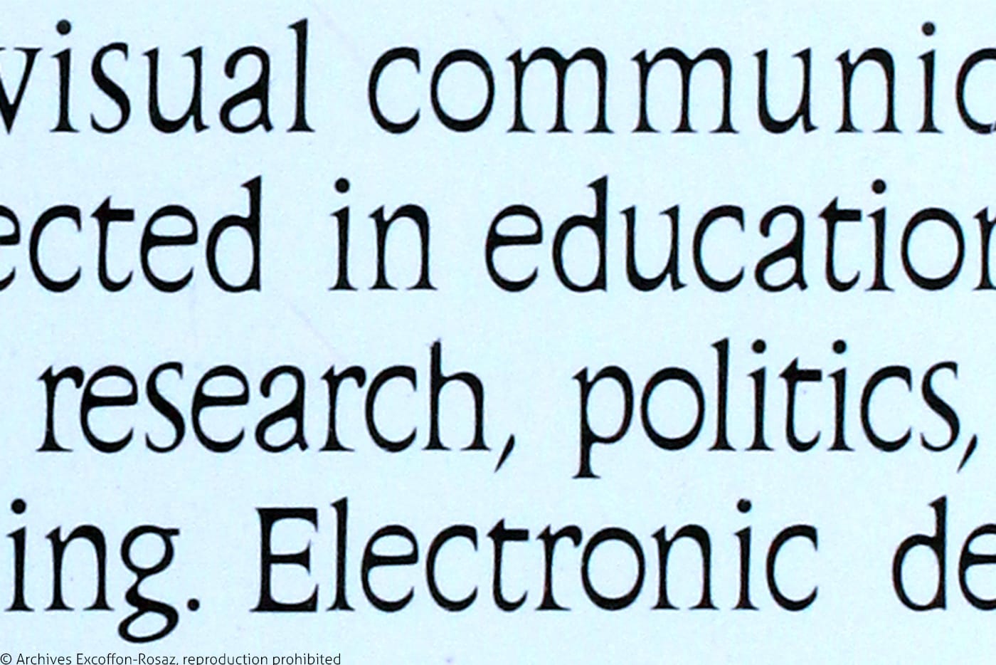
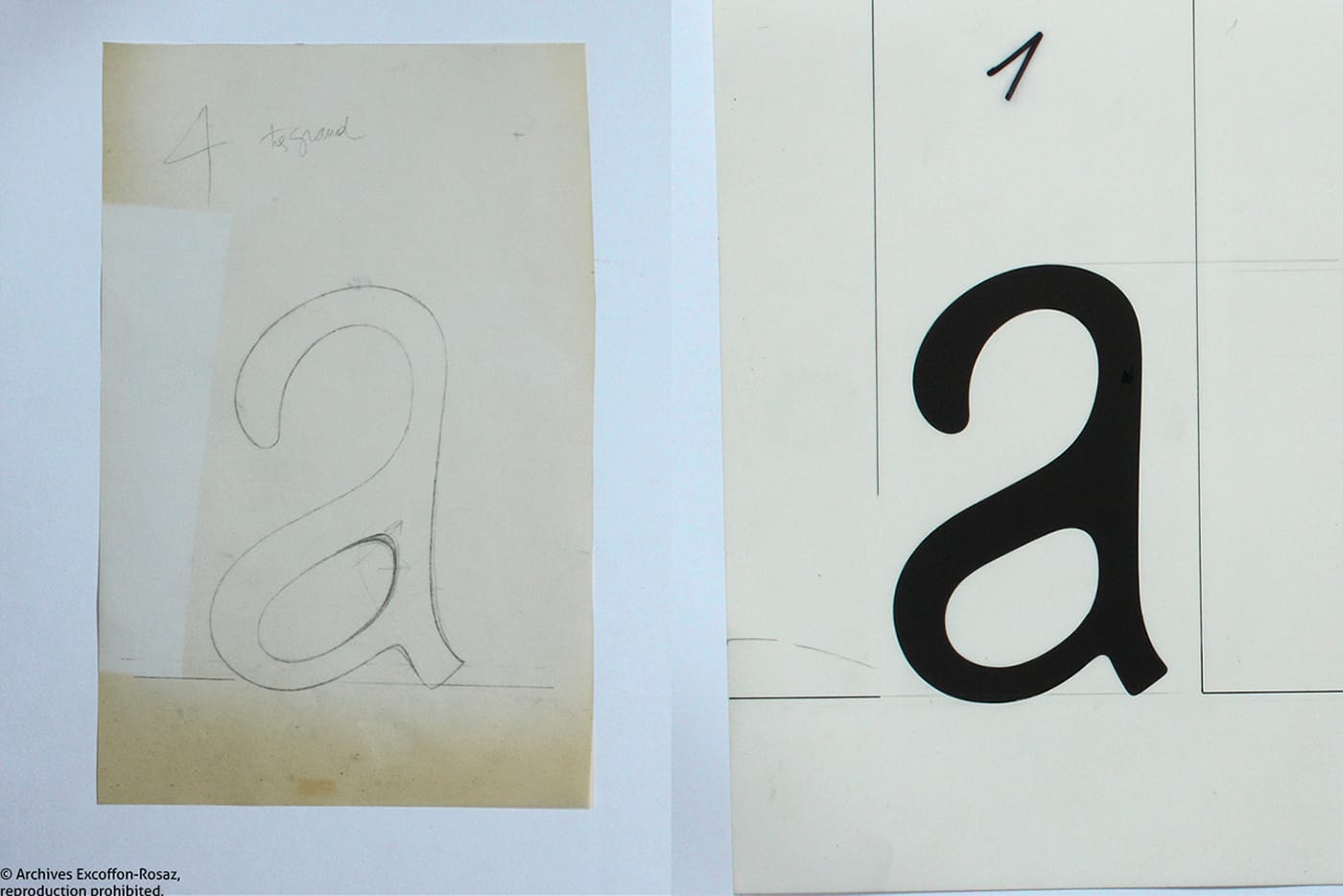
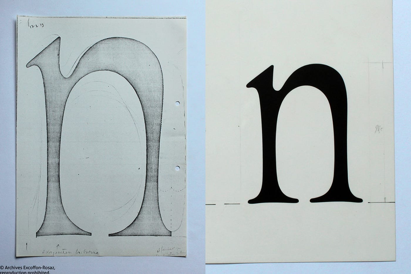
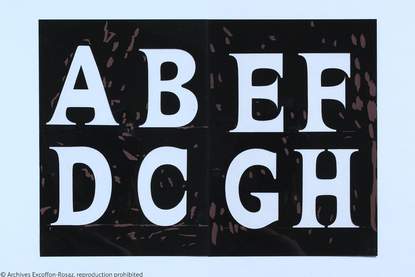
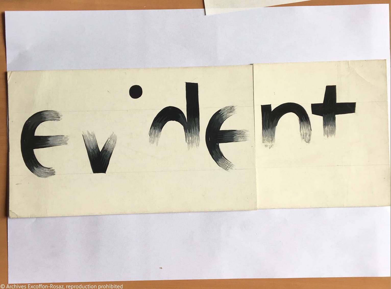
Forty years later, the preparatory sketches, their layers, and the various production drawings of the six weights of the typeface, are still in-wait in their boxes. The archives to which Roger Excoffon’s heirs granted me access, point to the extreme care that the creator took of his creation, as well as the high expectations he had for this typeface. As I begin the process of digitization and go back bit by bit in detail, it became apparent to me: the typeface was not completely finished. Even if most of the design decisions had been made, Excoffon still allowed for some variations and had not yet decided on all the vocabulary elements.
Along the way, I tried to learn more about the history of the typeface, discovering strong links between Excoffon Book and the typefaces that had preceded it; namely Mistral and especially Antique Olive. I realized that Excoffon’s entire career had been an important work of abstraction and analysis of his practice of typeface design. By 1955, he had begun to order his ideas and had planned to build a “reasoned study”, aimed at revolutionizing the conception of typographic typefaces. Twenty years later, Excoffon Book seems to be an extension, if not an outcome, of his effort of self-reflection.
This theoretical research, of which was already known in part, was also explored in depth in the excellent read: Roger Excoffon et la Fonderie Olive (Roger Excoffon and Olive Foundry), Sandra Chamaret, Julien Gineste and Sebastien Morlighem, Editions Ypsilon. However, everywhere that this research had been approached, the importance it would have assumed in the eyes of Excoffon never stood out, as so much of it was crushed by the power of the typographic work. The problem with this research is that it could never be embodied in its entirety by a published typeface. Neither Mistral nor Antique Olive were true examples of what Excoffon dreamed of, — that is what I discovered while working on the subject. Excoffon was never able to achieve his full ambitions… until Excoffon Book, which was unfortunately halted just before its publishing stage.
A difficult choice
In the summer of 2016, I found myself facing this unexpected dilemma: should I rehabilitate and publish this typeface, whose final design would not have been validated by its author?
– If I do, I allow this typeface to live, and I know for sure that it was of great importance to Excoffon, but I risk of betraying part of the author’s intentions;
– If I do not, I will not betray anything or anyone, but Excoffon’s dream of typographical revolution will remain largely unknown to the public.
In order not to remain alone in this dilemma, and with the intention of gathering as much information as possible on the subject, I attended two conferences in the summer of 2017 to present this work and the questions with which it came: once at the Rencontres de Lure, and the other time at the ATypI, Montréal. A capture of the latter event is viewable here. These two interventions gave rise to moments of passionate exchange that nourished me and allowed me to take a step back. Those exchanges also allowed me to measure the lengths of how much Roger Excoffon remains as a remarkable figure who continues to fascinate others even 30 years after his disappearance.
At the end of those two conferences, I conducted a survey by show of hands, where I asked participants to choose from the three following propositions:
1. Is publication of the typeface necessary, digitizing it as it is, thus preserving the errors that seem to subsist, but at the risk of possibly devaluing Roger Excoffon’s image?
2. Is publication of the typeface necessary, in a revised version, thus presenting the typeface as a coherent drawing, but at the risk of moving away from what the author might have validated if he had pursued publication?
3. Is publication of the typeface not necessary?
I tallied up the approximate results in a way that would be enough to reveal the larger penchants. Here are the results I obtained:
Rencontres de Lure:
1: 60 people / 2: 50 people / 3: 10 people
ATypI:
1: 10 people / 2: 45 people / 3: 25 people
At the Rencontres de Lure, an almost absolute majority (60 out of 120) were inclined towards the publication of the typeface, faithful to the choices of its master, without any modification. Here we can see the emotional attachment felt towards Excoffon the person, who himself was for a long time the President of the Rencontres de Lure, and someone whom some people at the assembly had the opportunity to know in person during his lifetime. A large majority was emerging in favor of publication of the typeface (110 against 10).
At ATypI, the results were significantly different. A much larger portion was against the idea of publishing a typeface that had remained unfinished during the lifetime of its author (25 out of 80). The majority nevertheless, strongly supported the publication of the typeface (55 against 25). And amongst this majority, there was a clear inclination for the publication of a revised version of the typeface (45 against 10).
Towards a two-part publication
To be honest, at the time of these conferences I was rather inclined to vote for the 3rd proposal, and not to publish. I viewed coming out with this unfinished typeface as a possible attack on the memory of Excoffon. My first thought was that to go ahead with this publication would mean to continue without the certainty that Excoffon would (or would not have) approved on how he would have liked various aspects of his typeface to be furthered, had he been able to work on it a few more years – of which he would certainly have wished to do so. Furthermore, this typeface is also rather strange and so different from the universe of form that is usually associated with Excoffon, making it all the more difficult to publish at a time when the author himself is no longer around to defend his choices.
At the end of these two public presentations, my convictions began to somewhat evolve, and my fears disappeared. The perceived interest for this project from my interlocutors convinced me that a rehabilitation of the typeface is possible. Provided of course that it is first done with all the necessary care, and that its publishing will be accompanied by sufficient contextualization for today’s designers to understand its specificities.
Henceforth, this is the direction this project is taking today. My intention is now to start by writing and publishing a pamphlet on Roger Excoffon’s typographical revolution project, and as a second step, to then publish the Excoffon Book itself.
The pamphlet will consist of an analysis of “the reasoned study” that Excoffon had begun writing in 1955 (with the assistance of Gérard Blanchard), while presenting comparisons to his interviews in the 1970s; interviews which revealed parts of his intellectual journey. I will supplement this with the testimonies of relevant people I have been able to meet, and whose experiences are enlightening from different points of view: either because they knew Excoffon himself, or because they knew the context of the time. Finally, I will summarize what I have observed while working on the Excoffon Book. All of this combined, will form a study that will profile the outlines and stakes of what Roger Excoffon called a “typographie nouvelle”.
This book publication should be followed, therefore, by a publication of the typeface itself. It has now been understood that one cannot really speak of “the typeface”, only a “version of the typeface”. And the exact form of this publication is not yet clear. Several options are still possible, and I still have time to ponder it over. It is likely however, that I am moving towards the solution of revising the typeface myself, even if that will mean my version will not necessarily be exclusive of other versions. And I’m also looking into the possibility of collaborating with other designers in order to enable a wider understanding of the ins and outs of this “typographie nouvelle”.
A stimulant for today’s creations
It will therefore take a little more time for this Excoffon Book to see the light of day. After 42 years, this typeface can wait a little longer. In the end, it seems to me that the most important aspect of this project will be to make others perceive the ambition that Excoffon himself had: the ambition to renew the art of drawing typefaces, and nothing less! While one might know Excoffon’s typefaces well enough, one is not always well aware of the depth of reflection that went into them. These years I have spent studying his work and interacting with those who knew him, convinced me that there is real interest in raising awareness of this aspect of his personality.
In my view, the publication of the Excoffon Book is no longer an end in itself. It has become more of a means to draw attention to Excoffon’s project of his vision of a “typographie nouvelle”, and to explain its logic. While this might not be an obvious method to try to trigger the revolution that Excoffon would have wished for — forty years after, and without him present… It can however be a way to highlight the daring attitude and creative ambition that the influential non-standard typographer himself had. An example now rooted in history, but one that subsequent generations can feed on for their own future research.
NB : to learn more about the work of Roger Excoffon, you can now consult a new dedicated website, designed by Axelle Le Sourd and Marianne Estrangin, two granddaughters of the multi-faceted artist.
